Japan 2012 - 21_21 Design Sight
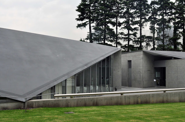
21_21 Design Sight is one of the main art facilities in Tokyo Midtown. It is an art gallery designed by Tadao Ando in collaboration with renown Japanese fashion designer Issey Miyaki who was known for his technology driven designs.
In some ways this was a departure for Ando from his usual rectilinear style. Instead of a flat roof, the gallery consists of 2 pavilions with triangular folded roofs with the lowest points touching the ground. The smaller pavilion houses a cafe, whereas the larger pavilion serves as the lobby to the gallery. Most of the gallery spaces are underground.
The form is simple yet elegant - typical of Ando's work.
The entrance is totally minimalist. Blink and you will miss it.
Instead of the normal paintings and sculptures by famous artists, this gallery focuses on everyday things seen through designer lenses. When I was there the exhibition was on everyday items from the Tohoku region on the northern part of Honshu - Japan's main island. The theme of the exhibition is "Tema Hima" - Time and Effort - and hints at the key ingredients that are essential to making great products and craft. There were table ware, baskets, kitchen utensils, rubber boots, slippers, and even food items such as dried fish and prawns. It was quite an interesting insight into the art of living of the people in that region, and how they turn the mundane into works of art. Unfortunately photography was not allowed in the exhibition and you will have to make do with my descriptions.


Comments