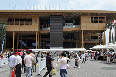
Shanghai World Expo 2010 - The Indonesian Pavilion
Unlike the Malaysian Pavilion which is a rehash of a very stale idea, our neighbour Indonesia was a bit more progressive in the design of their pavilion for the Expo. A Modernist structure clad in timber and bamboo, the Pavilion is simple yet elegant.


A large ramp takes the visitors to the upper levels of the exhibition halls. The exhibits are accommodated in a series of spaces along the circulation ramp. The main focus is on Indonesian culture, arts and crafts.

Attempts at eco-friendly design were not all successful. Like many other pavilions, there was an overuse of bamboo which is a beautiful plant but not necessary a great building material. This green wall with hanging bamboo planter pots didn’t do very well in the harsh sun – most of the real plants had died, and were being replaced with plastic ones !


Most of the exhibits are on arts and crafts.


At the exit there was a wall decorated with native orchids of Indonesia, and the floor of the exit was paved with cut sections of bamboo. I felt this was a more successful usage of the material.


Though the Indonesian Pavilion is not spectacular, it is at least a well-designed showcase for Indonesian arts and culture.


A large ramp takes the visitors to the upper levels of the exhibition halls. The exhibits are accommodated in a series of spaces along the circulation ramp. The main focus is on Indonesian culture, arts and crafts.

Attempts at eco-friendly design were not all successful. Like many other pavilions, there was an overuse of bamboo which is a beautiful plant but not necessary a great building material. This green wall with hanging bamboo planter pots didn’t do very well in the harsh sun – most of the real plants had died, and were being replaced with plastic ones !


Most of the exhibits are on arts and crafts.


At the exit there was a wall decorated with native orchids of Indonesia, and the floor of the exit was paved with cut sections of bamboo. I felt this was a more successful usage of the material.


Though the Indonesian Pavilion is not spectacular, it is at least a well-designed showcase for Indonesian arts and culture.


Comments