Shanghai World Expo 2010 - The European Pavilions Part II
Here's part 2 of the European Pavilions at the World Expo 2010. You will see that there are really no common themes here even though some of the countries are practically neighbours. After so many years under the Euro Zone, Europe remains as diverse as ever - and I think that's a good thing.
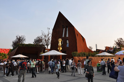
This is one of the weirdest pavilions at the Expo - the Luxembourg Pavilion.


The Switzerland Pavilion - this looks like an entry for the "Ugliest Contest". The main structures are a few concrete cylinders in various sizes which open up at the top to support a large platform. To it looks a bit like a missile silo or a deep sea oil rig. The little circular discs hanging down the side of the structure didn't help much. Right at the top visitors can take a ride on ski lifts. That's probably why it was so popular and there were thousands of people waiting in line.


The Spanish Pavilion - one of the most interesting looking pavilions at the Expo. The exterior is covered in wicker panels which was an attempt at using a sustainable material, but I felt that the effect was not entirely successful. The wicker were not very resilient to the elements and are beginning to show signs of heavy weathering just after a few months. The form though is very evocative of the Spanish spirit - proud, strong, and flamboyant. Reminds me of flags flying in the wind, and bull fights. Strange ?


The Finland Pavilion - another drum-shaped design that seems to be quite popular here. The entire building exterior is covered in fish-scale shaped panels made from recycled paper and plastic. It has a nice matte texture. This is a much more successful example of sustainable material, unfortunately the architecture was rather uninspiring. However, in some strange way it does evoke the quietness and loneliness that I imagine Finland to be.


The Austrian Pavilion. It looked like something starchitect Zaha Hadid would have done, albiet at a much smaller scale. This was actually by some relatively unknown young architects SPAN and Zeytinoglu from Austria. Like many of Zaha Hadid's work - the form is interesting in a sculptural way but lack soul or emotional resonance. Great sculpture must have the ability to connect with the viewer, but I don't feel any connection here. Would be great for a night club ?


The Czech Republic Pavilion - just a box.

The Bosnia and Herzegovina Pavilion.

http://cwfoodtravel.blogspot.com/
This is one of the weirdest pavilions at the Expo - the Luxembourg Pavilion.


The Switzerland Pavilion - this looks like an entry for the "Ugliest Contest". The main structures are a few concrete cylinders in various sizes which open up at the top to support a large platform. To it looks a bit like a missile silo or a deep sea oil rig. The little circular discs hanging down the side of the structure didn't help much. Right at the top visitors can take a ride on ski lifts. That's probably why it was so popular and there were thousands of people waiting in line.


The Spanish Pavilion - one of the most interesting looking pavilions at the Expo. The exterior is covered in wicker panels which was an attempt at using a sustainable material, but I felt that the effect was not entirely successful. The wicker were not very resilient to the elements and are beginning to show signs of heavy weathering just after a few months. The form though is very evocative of the Spanish spirit - proud, strong, and flamboyant. Reminds me of flags flying in the wind, and bull fights. Strange ?


The Finland Pavilion - another drum-shaped design that seems to be quite popular here. The entire building exterior is covered in fish-scale shaped panels made from recycled paper and plastic. It has a nice matte texture. This is a much more successful example of sustainable material, unfortunately the architecture was rather uninspiring. However, in some strange way it does evoke the quietness and loneliness that I imagine Finland to be.


The Austrian Pavilion. It looked like something starchitect Zaha Hadid would have done, albiet at a much smaller scale. This was actually by some relatively unknown young architects SPAN and Zeytinoglu from Austria. Like many of Zaha Hadid's work - the form is interesting in a sculptural way but lack soul or emotional resonance. Great sculpture must have the ability to connect with the viewer, but I don't feel any connection here. Would be great for a night club ?


The Czech Republic Pavilion - just a box.

The Bosnia and Herzegovina Pavilion.

http://cwfoodtravel.blogspot.com/


Comments