Beijing 2009 - Grand MOMA Beijing
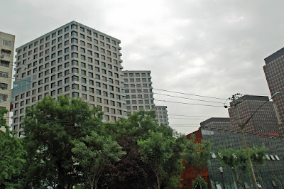
Close-up, the project isn't as impressive as presented in the magazines. The apartment blocks actually look like office towers, with their repetitive square windows. All of the buildings are covered in light grey metal panels. Colours are only applied in the window surrounds and the underside of the skybridges.
We didn't get a chance to visit the interiors of the apartments. Looking at some of the images available online, the design is very minimalist with a predominently white scheme.
Looking at the buildings, I just couldn't imagine them as nice cosy apartments. More like faceless cubicles.

The apartment blocks surround a central plaza which is mostly taken up by a huge reflecting pond. In the middle of the pond are 2 polygonal shaped buildings which houses a cinema for the complex. There is also a cylindrical glass tower which houses a hotel. In winter, the pond will be converted into a huge skating rink. According to the architect, the idea came from New York Central Park. All the walkways over the pond are designed to be removable for the conversion. This is perhaps the most intriguing part of the project.


One of the main problems with recent architecture in China is that there is often a mismatch between the grand idea and what is finally realised on the ground. The finished buildings look eerily like conceptual models - schematic designs which have been built without much design development and refinement along the way. Is this because of the speed at which things are done here ? Or is it because of the building process ? Whatever it is, there is a lot of money being spent, and a lot of lost opportunities.


Comments